Color picking Oklch for mortals
Perceptual color picking using the classic color picker
Complicated things
Some people really like complicated things, either because it makes them feel smart(er) or because it can be used as a flex for skill (or a masqueraded impression of skill), or because whatever l33tz0r reason.
Oklch is one such thing, it is complicated (at least for me), and screw it i'm fine with good old #hexcodes and coder colors everywhere. But the design community in social networks and other loud mediums embraced Oklch like it was the last coca-cola in the desert, if you are not using it you are outdated and do not have enough skillz.
To get a feel of how mind bending Oklch is, go ahead and play around with the (official?) Oklch color picker in https://oklch.com/ and then get back here if you are still in the mood.
Truth is there's actually something useful here in Oklch, and in this post I'll try a top-down approach to make it evident.
ELI5 Oklch
I am a passionate color picker creator, and I happily went down this Oklch rabbit hole, reading specs and trying to understand the matricial nature of colors in technical blog posts. A couple of years have passed, those ideas have matured, and here we go again.
Perceptual is key here, it means if you set the Lightness to 60% in Oklch, the subsequent colors you chose will all look perceptually 60% bright to a human being regardless of what color you pick.
This is of course limited by our ability to see colors in dark situations or in very bright situations, the amount of colors we can perceive changes drastically in different lighting scenarios, and this is what Oklch exposes to us.
The perception aspect of picking colors.
WTF is Chroma?
In this perceptual scenario where you can see different amounts of colors in different lighting values I like to think of chroma as the "amount of color".
If you like to be a bit more technical, then think of it as the amount of color if you remove the grayscale from it. How much color is left if compared to white, gray or black?
This varies with your monitor, some monitors can display more colors than others, Apple supports a large amount of colors, others support a bit less and others way more. If you are a developer you can check the range available in browsers using this media query.
When we are in perception land the term "chroma" is used, and in our perception "the amount of color" (chroma) is 0 when the Lightness is full back (we can't see colors in pitch black), and also the amount of color is 0 when the Lightness is full white (we can't see colors in full max lightness), then for the values in the middle of black and white the amount of color we can see varies, in a perfect lighting scenario we can see the maximum amount of color possible.
Chroma also varies with the color itself (hue), our eyes are amazingly well trained to see a lot of greens in some lighting scenarios, so we have a lot of chroma to chose from in greens when the light is good.
In the land of sight the three-eyed man is king
That's what LCH stands for: Lightness (how much light?), Chroma (how much color?), Hue (how many colors?) we can see at each of these values.
The "Ok" is just a technical feature that comes from the base work Oklch sits on top of (Oklab color space as the base for this representation). Essentially it means things are perceptually uniform, so we can move any one of the L,C,H components while the other two actually hold steady, even as we drift across the range.
Enhancing the classic color picker
Coming from a coder perspective, the thing that attracts me the most is not in exposing all of the Oklch features all at once, but instead on how to enhance and blend them in a familiar color picker.
The classic color picker
A hue wheel and a triangle:
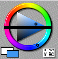
In the classical hex color scenario I'm a huge fan of the triangle as a picker tool because it tells the story of how we go from the fully saturated color (in the right cusp of the triangle) up to either white (top left) or black (bottom left) using its edges, and in the body of the triangle all the values in between.
It logically splits nicely the amount of shades and tints we have for each color.
Unfortunately these logic parts don't always hold when we deal with the human eye and its curves and discontinuities that naturally arise from biological perception.
Next up I am going to cram Oklch into this canonical color picker, in an attempt to expose the perception axis that comes with the former while also retaining the familiarity of the latter.
Adaptations
I don't want to bring in everything at once, the idea is to keep the spirit of the color picker but with slight changes that are useful when dealing with the new set of tools that Oklch gives us.
Hue wheel
The amount of colors we see is not the same for all colors, and it varies with the lighting, to make this stand out, I am adapting the color wheel that typically represents the hue to also show the amount of color available at each hue degree (for the chosen lighting).

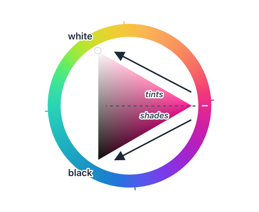
Triangle
The triangle is a nice tool to have in Oklch, however it no longer represents a clean split between shades and tints because the mapping is no longer linear nor balanced (blame our eyes). I am going to stretch the available shades and tints in the triangle, so that all of them are visible, getting rid of the shades/tints balance is a tradeoff. The gradient in the triangle is no longer perfect.
A cool thing to maximize intuition when picking Oklch is to make Lighting the king. This means that chroma and hue are dynamic, but Lighting stays the fixed. In the triangle this means that we go from max lighting to min lighting by just traversing vertically.
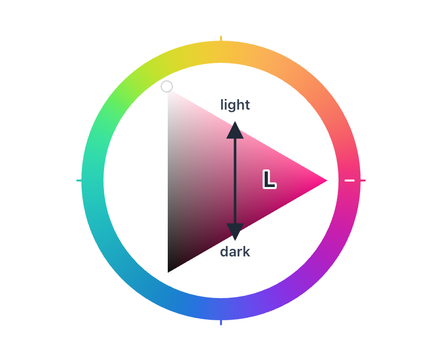
And when the chroma starts to get lost because the lighting is already too aggressive for our eyes to keep track of all that color amount, we see that in the triangle by navigating through its edges instead of its body. This is a cool thing, the triangle edges communicates the amount of lighting interval we have to work with while keeping the same amount of color. Maximum color is only achieved in a very specific perfect lighting amount (the cusp).
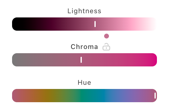
Sliders
Naturally sliders show up for Lighting, Chroma and Hue. These are orthogonal to Lighting (remember, lighting is king as an intuitive first approach to picking Oklch), which means that Chroma will have a non-fixed scale by default and adapts as we change lighting and hue.
The perfect lighting is shown with a dot, if clicked the lighting is adjusted to the one that gives us the max amount of chroma possible for the chosen Hue.
Then to flip the script, as a long tail feature I also want to allow chroma to be locked and set as the king. When that happens the chroma scale is updated to be fixed, and the lighting is the one moving instead. Also as a helper, the colors we cannot have the needed amount will be phased out of the hue slider.
We are all connected
Everything moves as we explore colors around.
And here with the locked chroma version:
Conclusion
In this post I tried to adapt the color picker to Oklch, making it more organic and dynamic, while also introducing a rough working guideline for the concepts behind it by treating L as if it was the lighting in the room, even though it's really a property of the color (hey in my defence it was in the ELI5 section). I also just ignored and jumped over a few important concepts along the way (color spaces, iluminants, gamut mapping, color management/correction, etc...) because the point was really the possible color picker experience through one of many infinite possible metaphors for it.
You can play with it here
It is also available as a Figma plugin.