Minimal Color Swatches
A look into the color relations that went into creating a simple color palette generator.
Recently I gained a boost of motivation that made me want to look into colors and drawing tools again.
I hate choosing colors, and it is tough for me to find good mixes of related colors that look well together and have multiple use cases.
For this reason, I have long been cultivating an attraction towards color pickers, the idea that software can help me choose colors and give me good working sets of matching colors.
Naomi Danielle gave an excellent explanation of making minimal and exciting color palettes a while back. At that time, I had not enough energy or motivation to pursue this idea, so it went into the bucket list until now.
This blog post explains my rudimentary interpretation of the idea behind it and provides simple examples of its inner workings. The final objective is the implementation of it all as a simple color palette generator, which is available here.
Don't pick me.
Pick a color. This color will be the root color for a minimal palette of 12 other colors.
For example purposes, I am going to roll with #69b9d9.

To ease the creation of the 12 variations, I will use HSL (Hue, Saturation, Lightness), a common RGB alternative that allows varying the color lightness and saturation directly.
Hairy Gray.
Each color in the palette will have its light, which means that light will not be uniform across all colors, allowing artists to use darker tones and lighter tones consistently if they stick to the palette.
Taking the base color chosen, start by deciding which is the brightest and darkest tone possible (I am going with a max of +25 Lightness and -25 for the darker one, but roll your own).
Then create a gradient by splitting the difference into five tones each way.
Now create a relationship between these color variations by zig-zagging them and filling the two missing spots of the final palette layout.
Zig-zagging the lightness creates visual ways to establish relations between them.
No more can be absorbed
As with lightness, the palette must provide an excellent range of color saturation. I replicated the lightness logic to get the color saturation range as an initial approach.
Using the same Zig Zag logic for saturation produces the following effect.
However, after playing around with the final palette of colors, I found that this produced a high emphasis on the light colors and a lower focus on the darker shades. Coinciding the saturation highs and lows with the light did not make a balanced final result to my eyes.
After showing it to a couple of friends, I opted to rearrange the saturation in an alternating fashion, highs-lows-highs from the base color outward.
Hue is a lovely city
For Hue, the logic is denser. I have failed to formalize it in a good way in this palette generator. The idea is to shift the base color 118º in one direction and 34º in the other—these values I took from the Danielle example.
Then the relations for all the palette diamonds involve dividing by two and sometimes by four. These relations are present in the hueValues() function in the code. They are fickle and sometimes jump, but the overall result is good enough.
At the end of the night
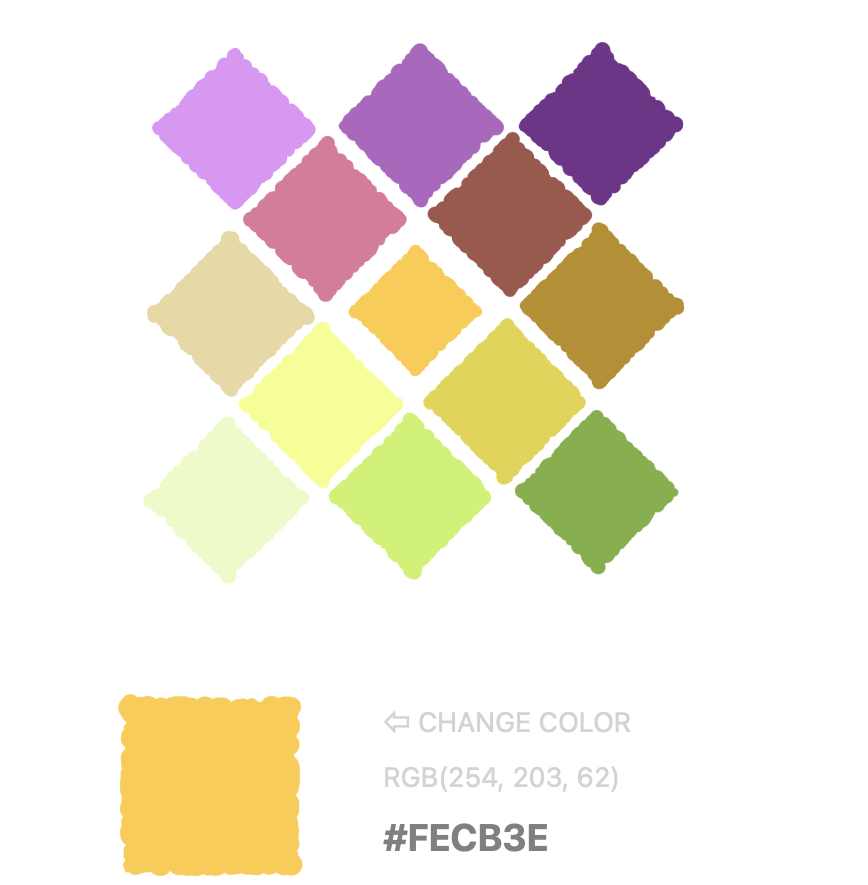
The final palette uses this lightness, saturation, and hue palettes.

Using the system color-picker, we can make these colors act alive.
Final words
Creating this palette generator was my first Svelte project.
Svelte is a lean front-end framework with an excellent initial community in Portugal. Their help and patience were paramount as I routinely bombed their Discord channel with questions and bugs.

If you would like to get involved, here is an invitation link.