Color picker
Color picker as a trusty rebound hobby project
I made my first color picker almost ten years ago, in 2015. Since then, my passion about color pickers grew a little more than expected and this month I finished my 6th one. I only have the code for the last 3, the others are now likely in the Elysium of color pickers (or some old laptop hard drive in my basement).
What's so special about color pickers?
They have graphic and visual usage patterns that are uncommon in UI widgets. Most widgets are drop-down boxes, sliders, etc., and then there are color pickers. Besides, choosing colors has always been a challenge for me as a developer with little aesthetic sense. During college, I made some websites to earn some extra money, and when it came time to choose colors, it was a headache.
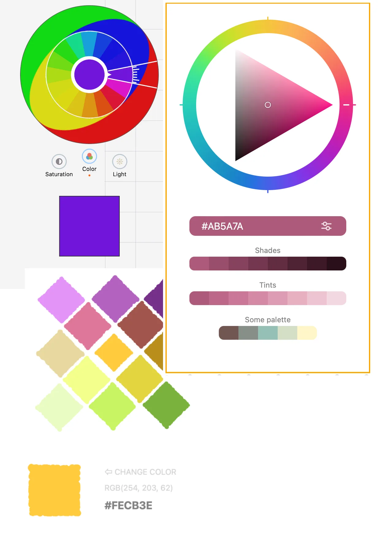 Image: Some color pickers I've done
Also, color pickers have been my testbed of some ideas and concepts, not necessarily directly related to the act of color picking per se. Color pickers also act kind of like my todo apps or hello world. Shreds of a multidisciplinary learning process loitering erratically for purpose. Calculated efforts with messed up cost-benefit evaluations.
I'm looking for a rebound project, can you be it?
There are plenty of reasons not to implement a color picker. Not only they barely have any commercial value nowadays, but they are also not very suitable standalone apps without having a lot of extra differentiating features.
There is really not much to be done. Every mature component library has one. The device you are reading this has one (try it out, click here: ). All design tools ship with very good color pickers packed with features. More color oriented niche designers and illustrators have at their disposal a wide range of color plugins available. These plugins can cover all advanced scenarios: accessibility concerns, contrast, harmony, related palettes, color spaces that no one can name, etc...
To top this, color pickers are not a particularly fun thing to do, and kinda annoying to do well. They are even frustrating if you want to make them generic enough so that they work and fit with whatever framework your potential users might be using.
In the end, colors pickers exist as forgetful side-kick widgets in someone else's grand plan. They are not meant to be the hero of the story and you have to scrap for reasons to invest time in them.
But that never stopped no one.
The color picker "hello world"
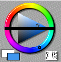
The original, traditional, color picker is the one with the wheel and the triangle invented by John Derry.
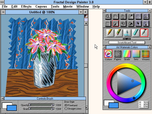
Despite being the first one, imo it has a lot of cool things that sometimes are not found in more modern color pickers.
Here is a commonly modern color picker, to contrast with the one above. A slight variation of this can be found in a lot of modern design tools:
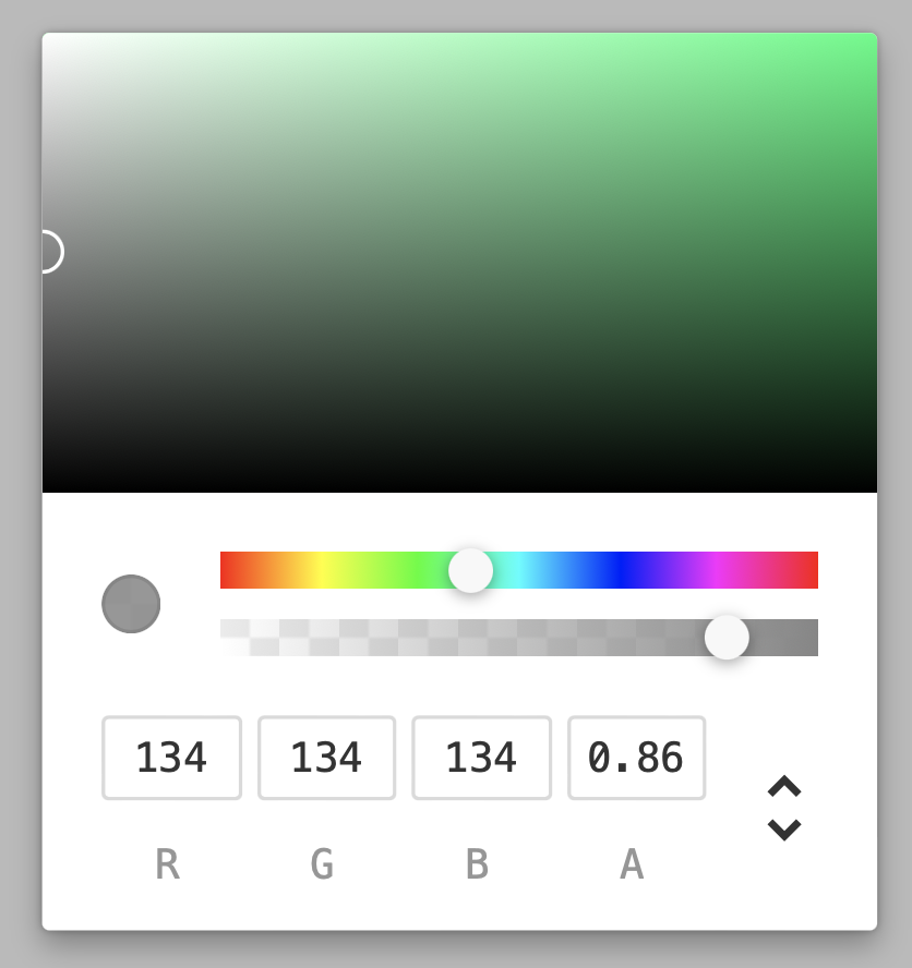
I find that original ideas are often the most elegant, and like Leonardo Da Vinci said:
"Simplicity is the ultimate sophistication"
There are many good reasons to choose a more modern color picker (one with the square and the sliders) however for the purpose of suiting my narrative I am going to squeeze a few reasons why the original triangle color wheel is better.
Let me start by dissing the modern common color picker that uses a square/rectangle.
Modern square has a disproportion of shades
Take a look at a variation of the common modern color picker, and focus on the square/rectangle it presents.
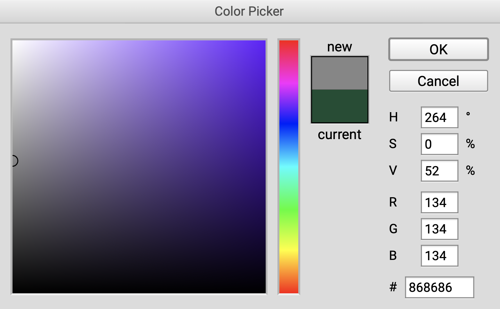
In that image, we have a huge area of 100% black pixels. A whole row of 100% black at the bottom.
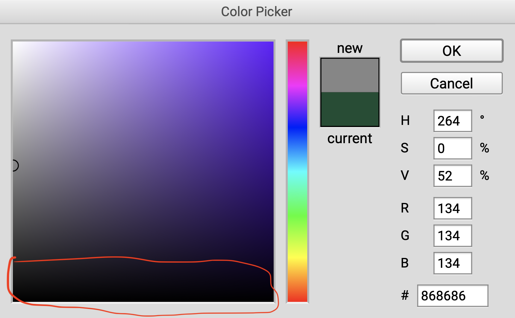
Now contrast this with the single 100% white pixel you have to chose the white color. Just one at the top left corner.
If you don't have a strong education in choosing colors (like me) then there might be a good chance that a darker color will be chosen with this kind of color square layout.
Modern square has a weird slope for tones
Lets pick two colors and draw a line between them.
First: pick the intermediate gray (50% gray), this sits in the middle of the leftmost edge (1).
Second: pick the highest saturation color in to the top right corner (2).
If we draw a line between them, from 50% gray to 100% color, we have this:
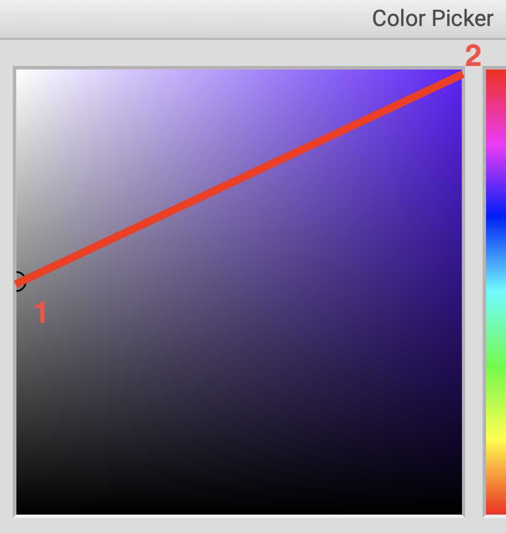
This split has a big bias to it. The amount of darker colors below the line is way bigger than the whiter tones above the line.
The triangle equilateral movements
Lets move to the triangle now, and explore by pointing out why the original triangle is still the superior color picker for shades, tones and tints.
Here is my approach on it:
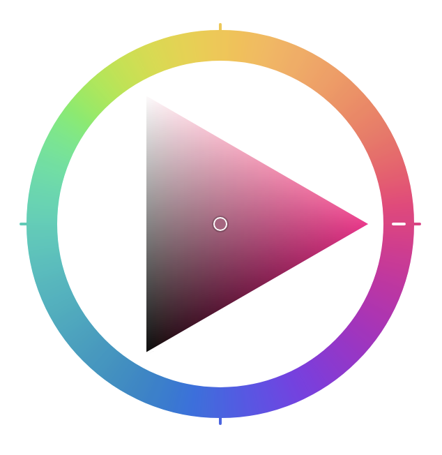
Tones are set along a horizontal line
An horizontal line:
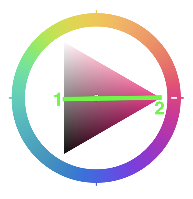
In the original triangle representation if we pick the intermediate 50% gray (1) and like before draw a line to the strongest color (2).
We get an horizontal line, fewer repeated colors and a more equalitarian distribution of clearer tints (above the line) vs darker shades (below the line).
Shades and tints are spaced through the edges
In the triangle the 100% chroma is always located in a very easy to pin position:

If we start from this position, it becomes easy to add more white, or more black to the color. This can be achievied by moving the thumb along the edges of the triangle like in the video below:
The wheel and the slider
Hues are typically set in degrees from 0 to 360, where 180 marks the split between the commonly known "warm" and "cold" colors (I think warm and cold are just another fuzzy human thing without much connection to temperature).
In the original color picker wheel, this would mean warmer colors at the top of the wheel, and colder at the bottom.
My attempt
The most recent color picker I did was along the lines of the original color wheel triangle.
The biggest difference might be that I added the possibility to interact with the wheel by dragging it to chose a Hue. The original color picker used two thumbs, one for the wheel and one for the triangle.
It also took me about 20x more time to "design" this than it would a beginner designer.
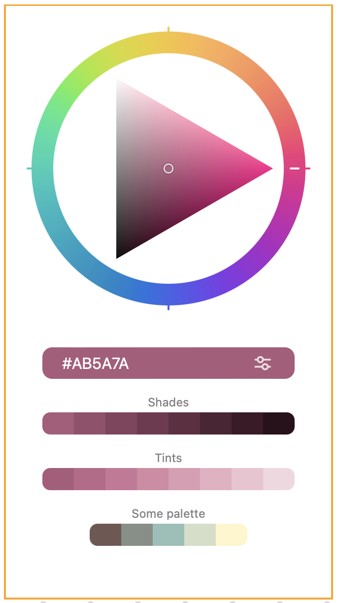
You can play with it here or as a Figma plugin.
Final words
I keep going back to color pickers. Driven by the somewhat unique place that they hold in the world of UI widgets. Driven by my lack of aesthetics and passion for stuff that is slightly out of my comfort zone.
The intention of this post is that it can be inspiring to you. I hope to have shared enough of the passion I find in color pickers, so that you can find extra shine the next time you find yourself staring at a color picker.